Visualization System for
Large Amounts of Data
information in a meaningful way
Problem
Every marketing campaign generates a lot of raw data. These data are looked at by people in different roles and in different contexts.
Users need a system that displays the right amount of correct information for the context that users look at on every screen.
Solution
We created a system that considered the type of persona and the context that persona was in when it displayed the information. The system incorporated and AI agent, which learned from the previous interaction with the user what information was needed and when and presented that information first.
Team
■ Head of Design
■ Interaction Designer
■ Visual Designer
■ Product Manager
■ Product Marketing Manager
■ Data Scientist
■ Design Technologist
■ Customer Support Team
Process
COMPETITIVE REVIEW
Reviewed four of our closest competitors and other relevant data visualization applications existent in the market. All of them presented the users with a deluge of information through which users where expected to dig to find the relevant information for their needs. We agreed that the best way forward was to present information in relevant layers tied to the context in which users were.
EARLY CONCEPT WIREFRAMES
The first iteration still had a lot of extra data that was displayed and it did not really consider the persona that was interacting with the system. At this stage the AI agent was not developed yet so we needed to simulate it during our usability testing. After a round of usability testing we realized that the best way forward was to present the information in layers relevant to the persona and the context in that particular moment.
Final Design
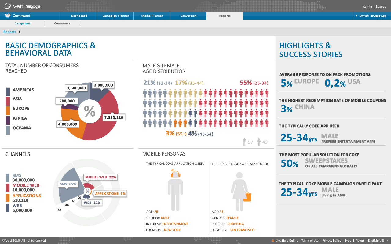
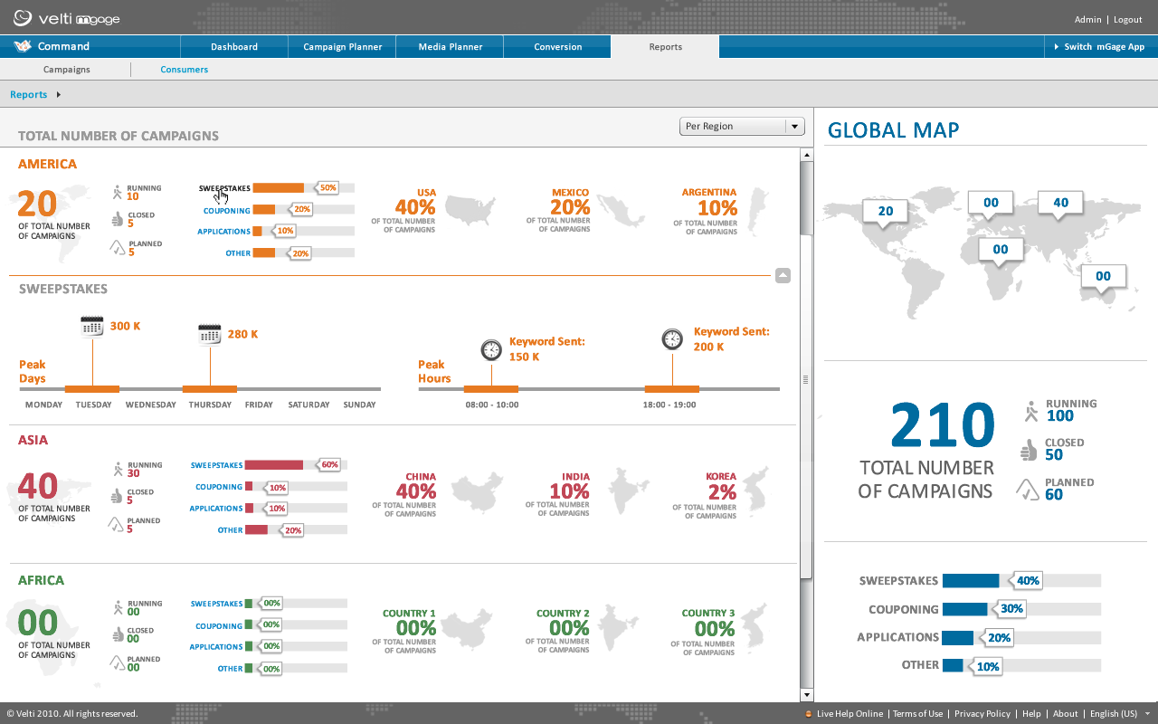
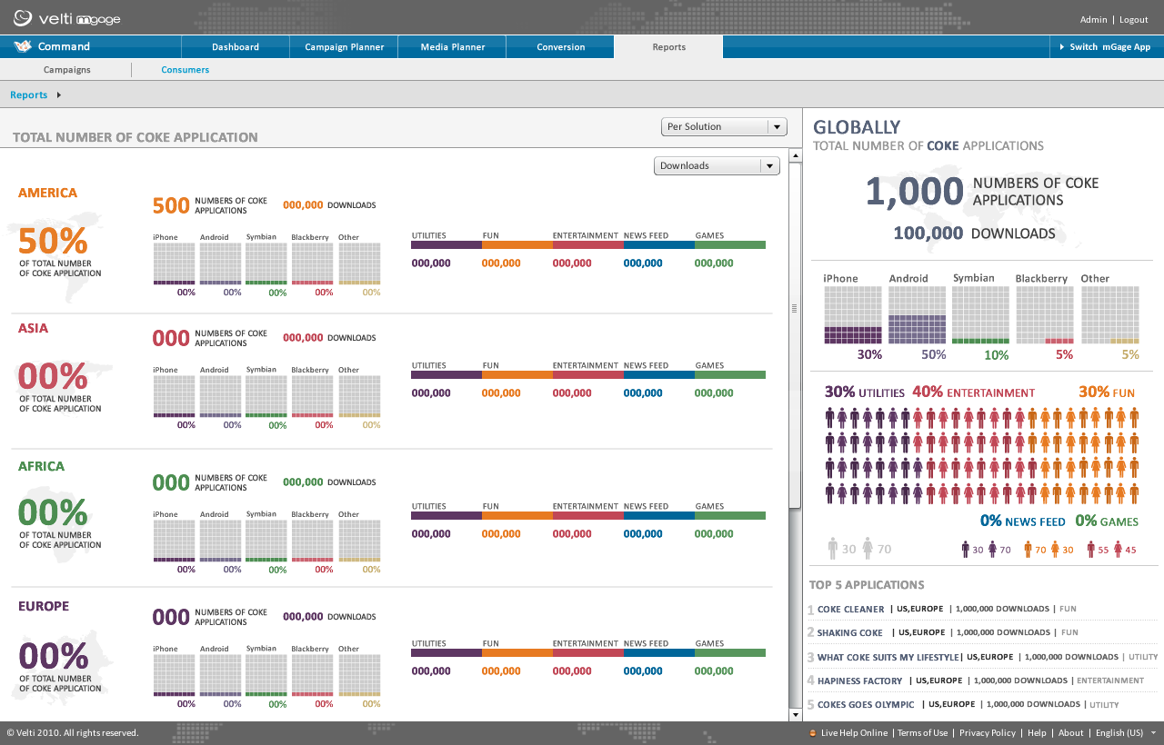
After a few rounds of rapid iteration prototyping and testing in which we gathered information about additional features and how the different personas use the system, we finalized the design with the version below.
■ Less is more. “Above all else show the data.” (pg. 92). Erase everything you do not need.
■ “Graphical excellence consists of complex ideas communicated with clarity, precision, and efficiency” (pg. 51).
■ Keep it proportional. “Lie factor = size of effect shown in graphic divided by size of effect in data” (pg. 57). The ratio should be as close to 1 as possible.
Results
This approach was an instant success with our clients. In particular Coca Cola had seen an increase of over 12% in global sales and especially in Europe by using this new system. It allowed their marketing professionals and executives to have real-time, meaningful insights into all the campaigns they were running and what the sales numbers were at any one point.


