Mobile Talent Acquisition Application
A solution for recruiters and hiring managers who want to manage their
candidate queue anywhere they are
Problem
The workplace has become much more mobile than ever in the past. As a consequence employees require tools that allow them to work from anywhere. Most of the current tools (including this one) offer very little, if any, support for remote work.
Solution
We redesigned a very powerful and popular (market share over 60%) application to support remote work. We incorporated the results our research team had uncovered to make a seamless integration with mobile devices. Our focus was on:
- Have a mobile design first approach to ensure users can access the information from a variety of devices
- Make use of in house research results to provide more intuitive way to display the information especially on mobile devices
- Reduce the pathway length users have to navigate to accomplish a task
- Provide a scalable solution
Team
■ Head of Design
■ Interaction Designers
■ Visual Designers
■ Inside Sales Manager
■ Front-end developers
■ Product Managers
Process
data analysis and user research
At the time of the redesign the application had already been established in the market. This provided a trove of usage data our research team could go through. These data revealed that a significant portion of our users go through five or more steps to accomplish any task.
Qualitative data had also revealed that although users loved the tool for its feature reach environment, they also disliked how overwhelming it felt even after multiple uses. Some of the users confessed during interviews that they would rather let other colleagues accomplish tasks for them and “owe” them than try and use the tool themselves. We wanted to find a better way to present the resume information that works on a variety of devices. That research is presented in the resume visualization project.
Reviewed four of our closest competitors and other relevant data visualization applications existent in the market. All of them presented the users with a deluge of information through which users where expected to dig to find the relevant information for their needs. We agreed that the best way forward was to present information in relevant layers tied to the context in which users were.
Reviewed four of our closest competitors and other relevant data visualization applications existent in the market. All of them presented the users with a deluge of information through which users where expected to dig to find the relevant information for their needs. We agreed that the best way forward was to present information in relevant layers tied to the context in which users were.
EARLY CONCEPT WIREFRAMES
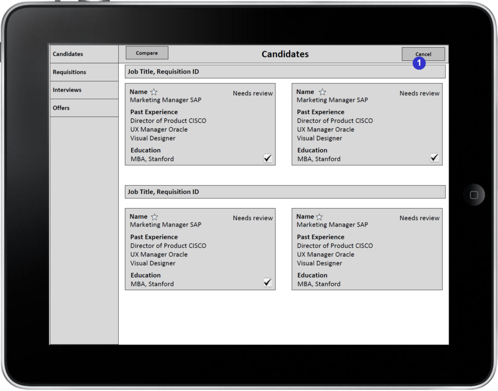
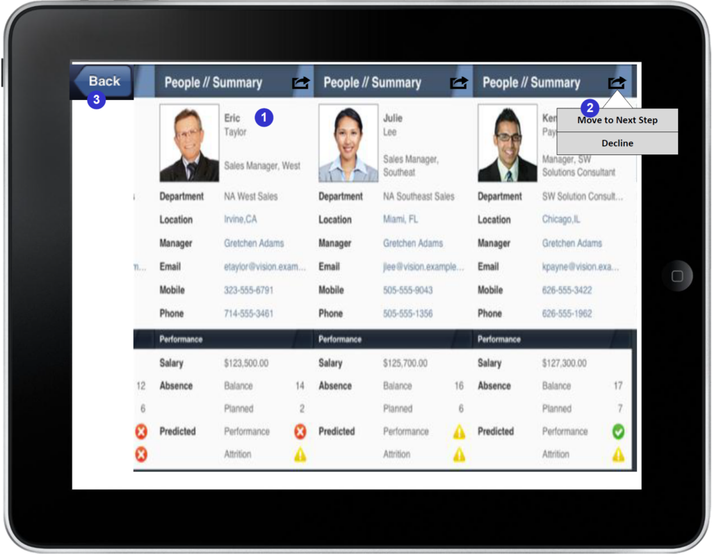
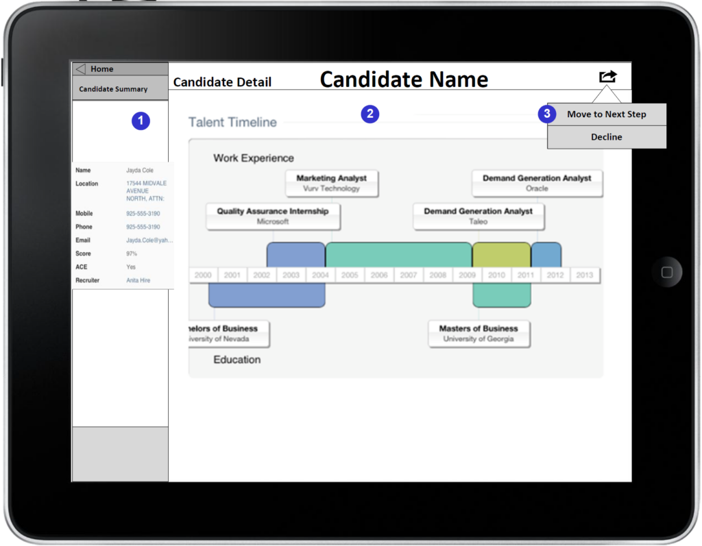
Inspired by the very promising research results, we started developing prototypes to use in our rapid iteration sessions. However, due to middle-ware technological constraints, we could not implement all our findings exactly how we tested them with out customers. Illustrated below is a prototype that showcases a version of the employment timeline. It also features the interaction specification bullet points, which help developers understand the interaction paradigms.
design execution
Feedback: During the iteration phase of the design we received feedback not only from our customers, but also from other stakeholders within the team. We were in constant communication with the product management and development teams to ensure the full list of features was supported and that the solutions we proposed had technological support. As illustrated previously in this case study, several times we had to make adjustments to our designs based on feedback from the development team.
Visual Design: Our team was part of a larger human capital management (HCM) organization within Oracle. As such, we had to integrate into a larger visual standard for our applications. I had worked very closely with our visual designers, and acted as a liaison with the larger visual design organization to ensure our visual designs aligned to the corporate standards.
Final Design
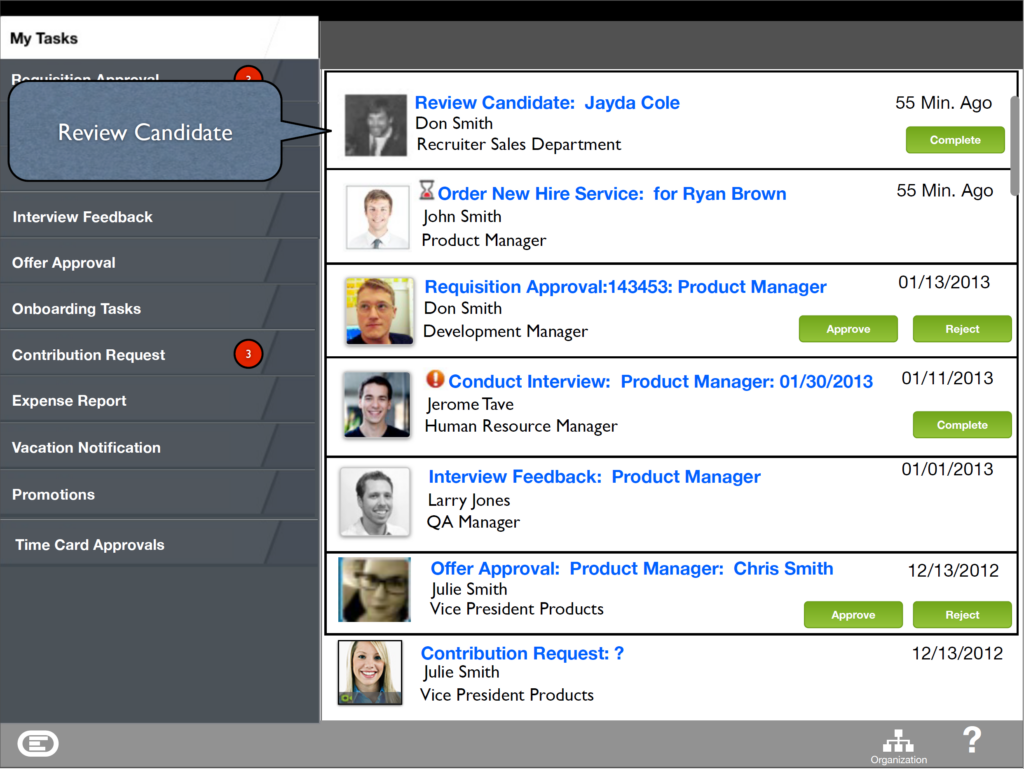
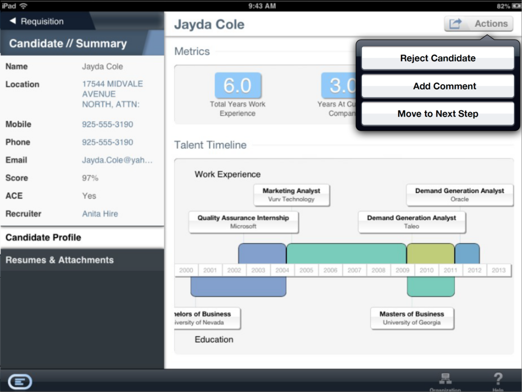
With careful planning and execution we were able to incorporate a substantial amount of the research results and initial designs into the final product. We were able to use a version of the visual resume and were able to cut the taps required to accomplish a task down to two in some cases. As an example below is the final version of reviewing a candidate.
Results
The redesign was highly successful. Here are some of the metrics of this success:
- Increased retention by 33%
- Increased the number of closed deals by 19%
- Decreased the close time by 7%
- Increased the average amount of a deal by $2mil
