Venmo Microloans
Borrowing and investing with friends
Opportunity
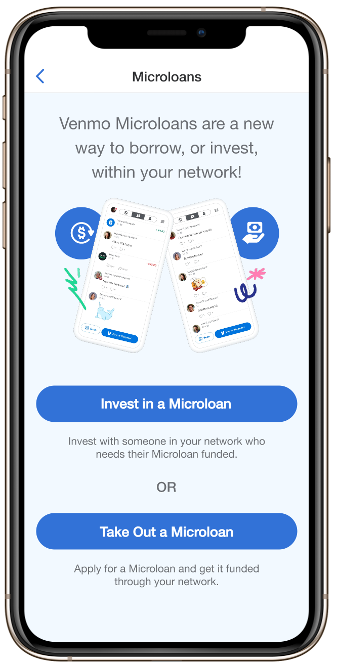
Competitive analysis revealed that Venmo occupies a unique position in the P2P market — it does one thing (payments to friends) very well, and in a way that’s unique and appealing to its audience. Leveraging that appeal of easy financial transactions among friends into a microlending space could create demand for services that typical Venmo users might otherwise avoid, and create a new revenue stream for Venmo through loan interest payments.
While several online platforms already exist that connect lenders to borrowers for microloans, the borrowers are typically impoverished people in underdeveloped countries. No service seemed to exist at the time in the US where friends fund loans to each other in a closed network, earning interest for the friend-lenders.
Solution
I lead an interdisciplinary design team in several areas:
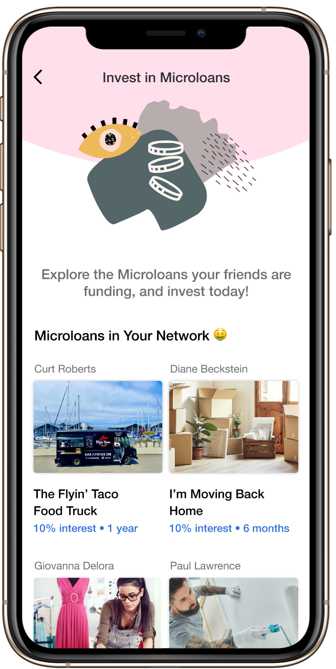
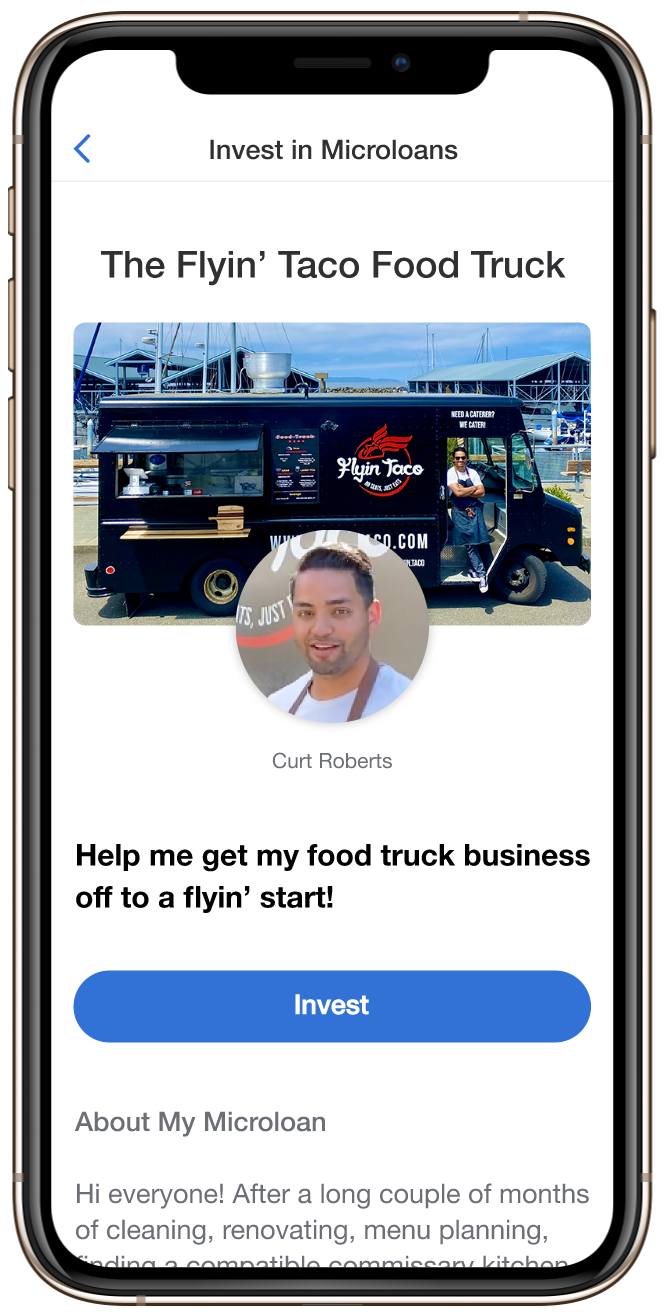
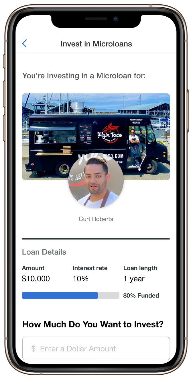
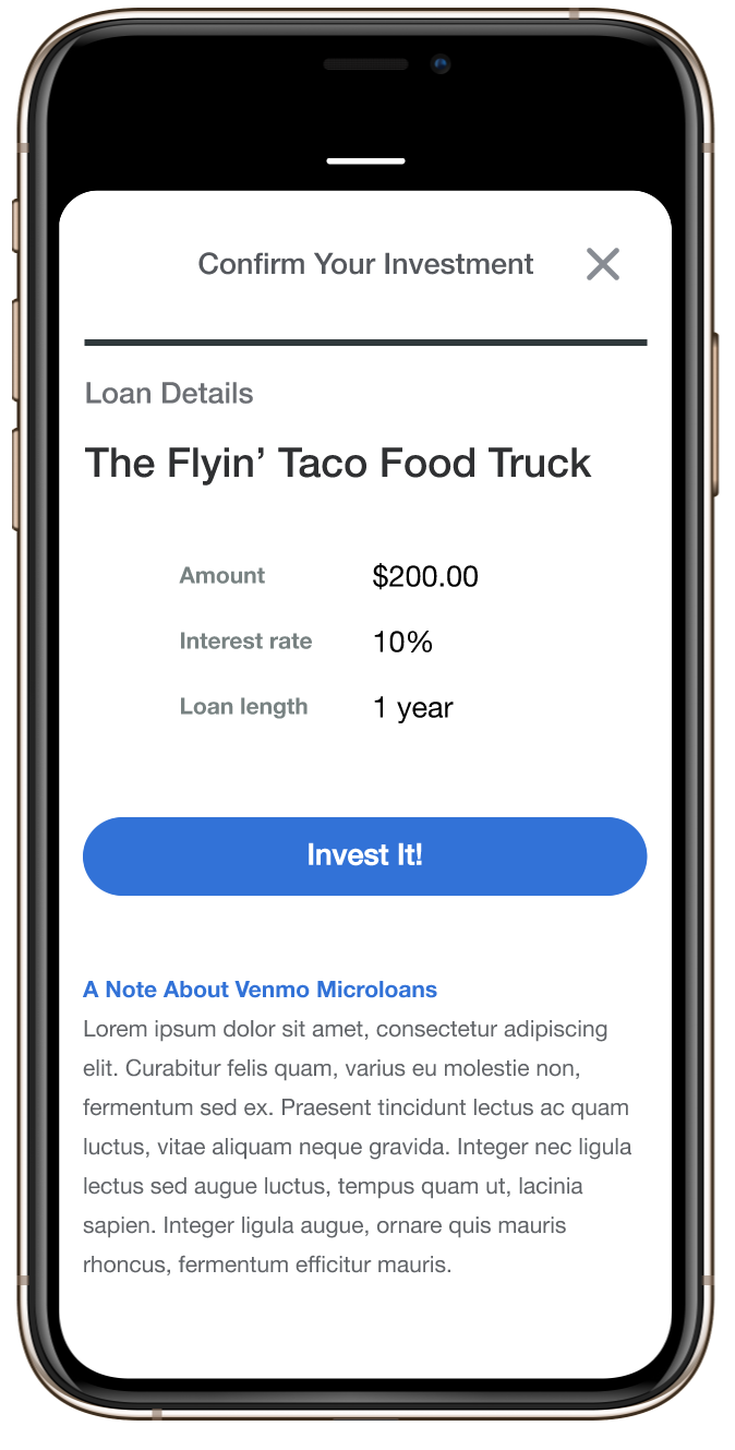
- Design screens that highlight groups of loans, as well as individual ones, and a checkout path for investments
- End-to-end loan application workflow with minimal number of screens
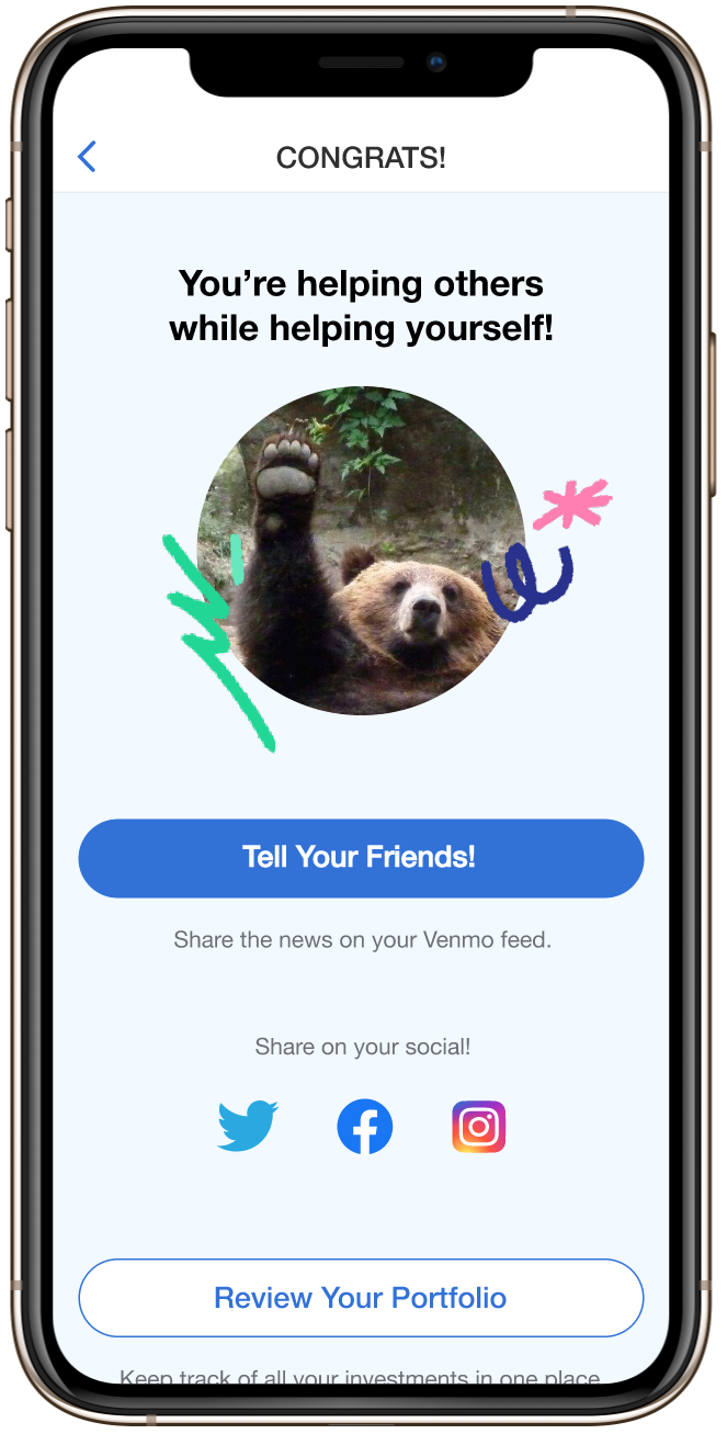
- Social media transaction posting workflow
Team
- Head of Design
- Senior Visual Designer
■ Product Managers
■ Developers
Design Vision
This new promising feature had the potential to open up new revenue streams for the company and solidify our place among the top P2P payment applications in the market. Therefore, it was vital to create a workflow that was pleasant and fun but, was also close a new financial transaction expediently. To accomplish this goal I followed a series of steps:
- Gathered inputs from the stakeholders to inform the vision
- Run several rounds of qualitative research to build accurate personas and inform design
- Deepen our understanding of the customer by creating journey maps
- Test different versions of our high-fidelity prototypes before getting company-wide acceptance of the product vision
Process
requirements and user feedback analysis
This new promising feature had the potential to open up new revenue streams for the company and solidify our place among the top P2P payment applications in the market. Therefore, it was vital to create a workflow that was pleasant and fun but, was also close a new financial transaction expediently. To accomplish this goal I followed a series of steps:
- Gathered inputs from the stakeholders to inform the vision
- Run several rounds of qualitative research to build accurate personas and inform design
- Deepen our understanding of the customer by creating journey maps
- Test different versions of our high-fidelity prototypes before getting company-wide acceptance of the product vision
We started with competitive analysis to gain in depth understanding of the flows of crowdfunding and microlending sites. We enhanced our understanding with user surveys to identify the right variables for borrowing and lending, and their motivating factors. Then we fine tuned this with one-on-one interviews which provided qualitative insights into key points of users’ journeys.
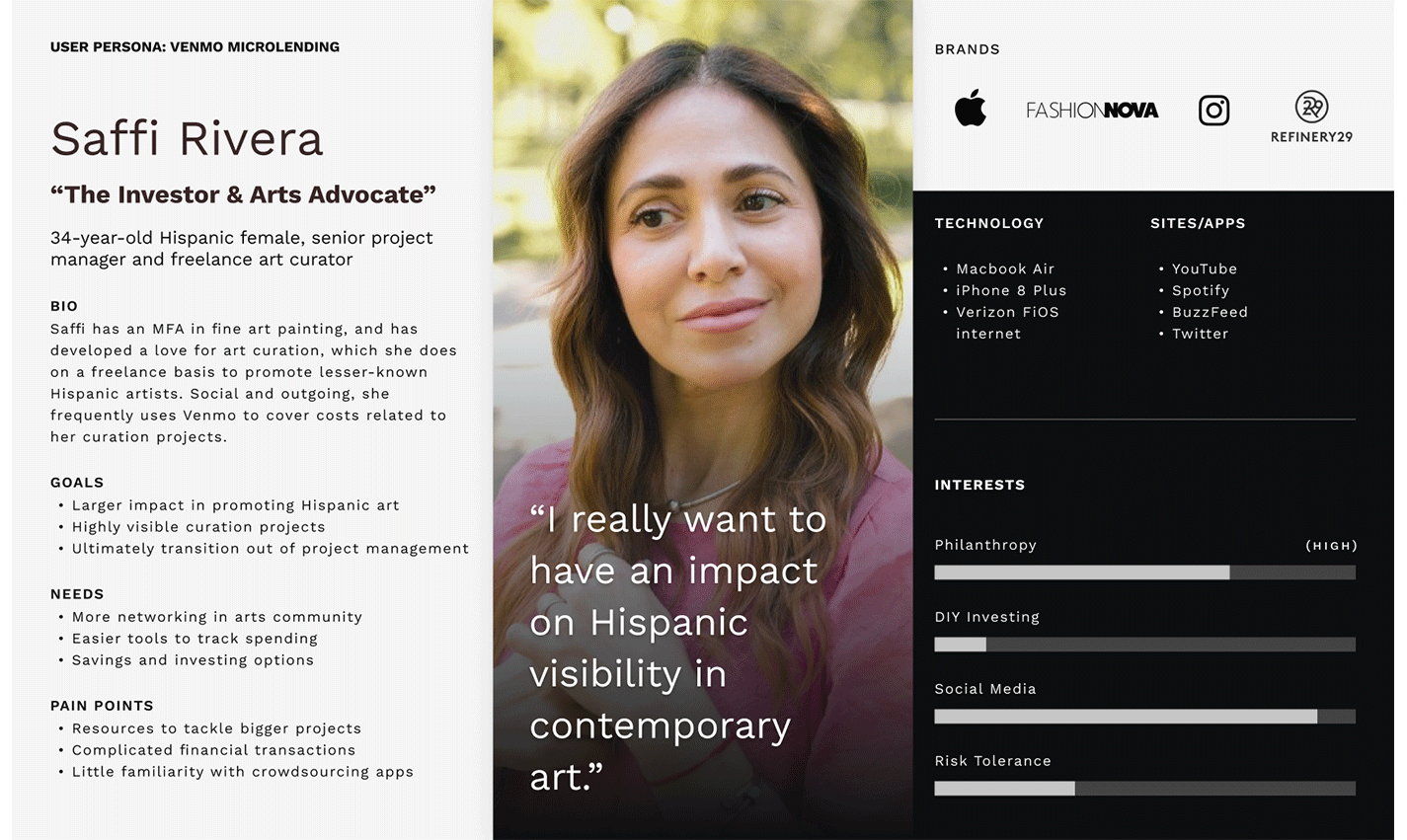
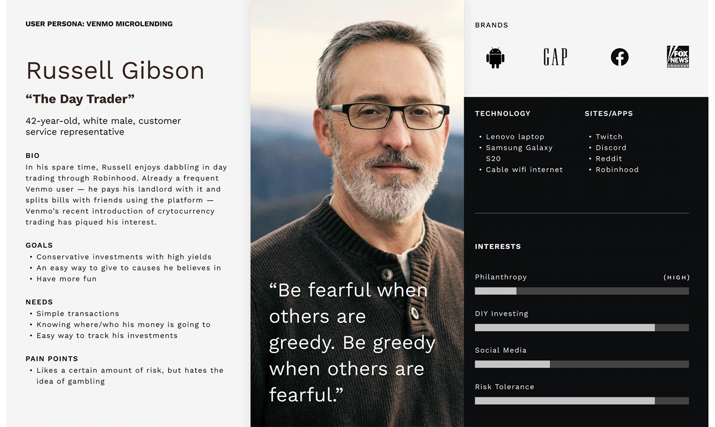
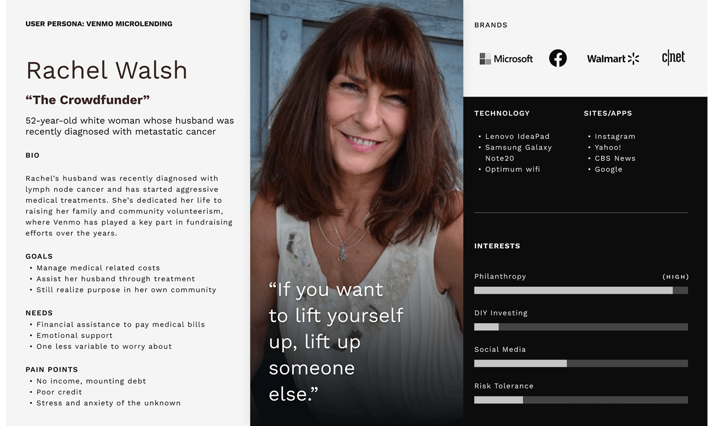
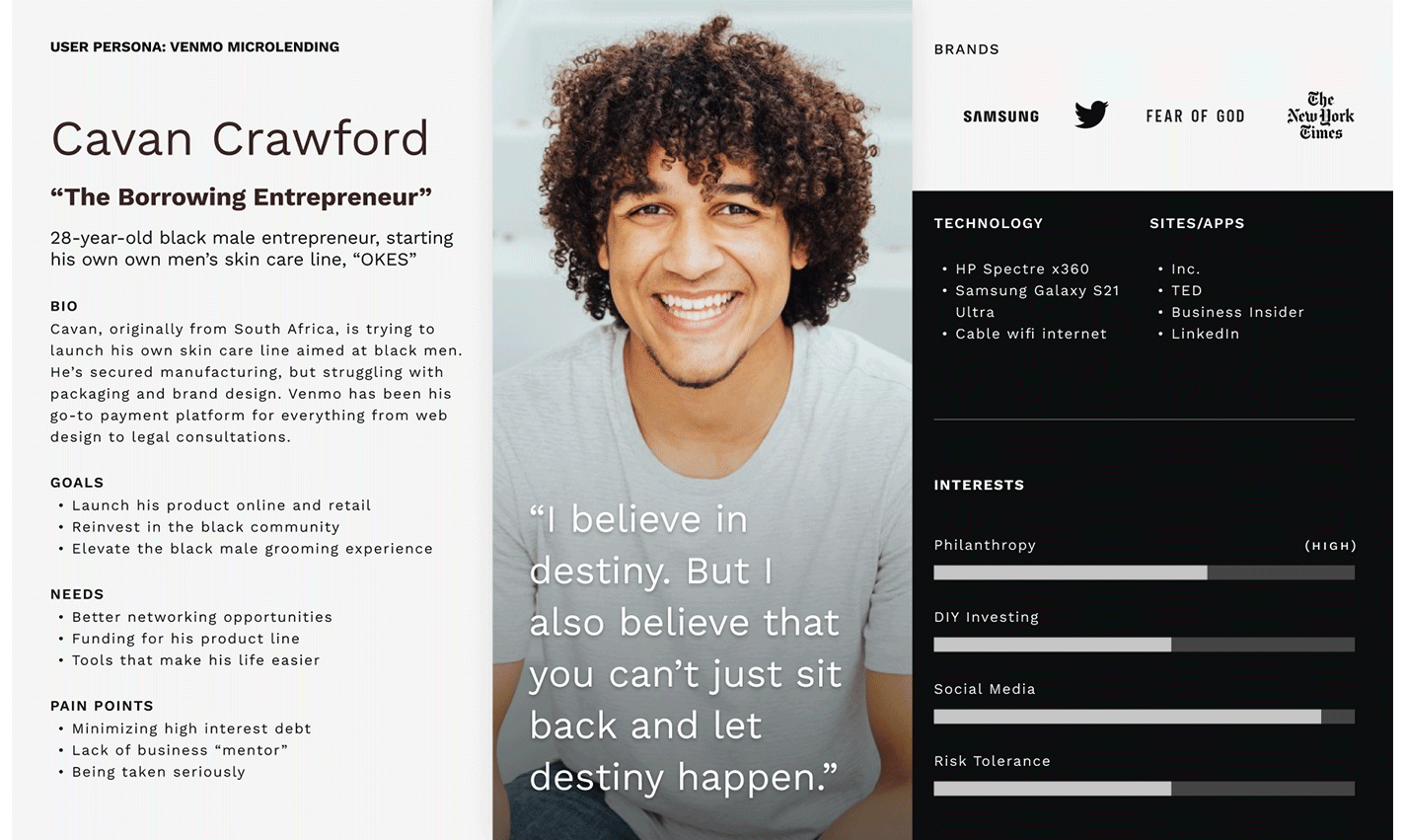
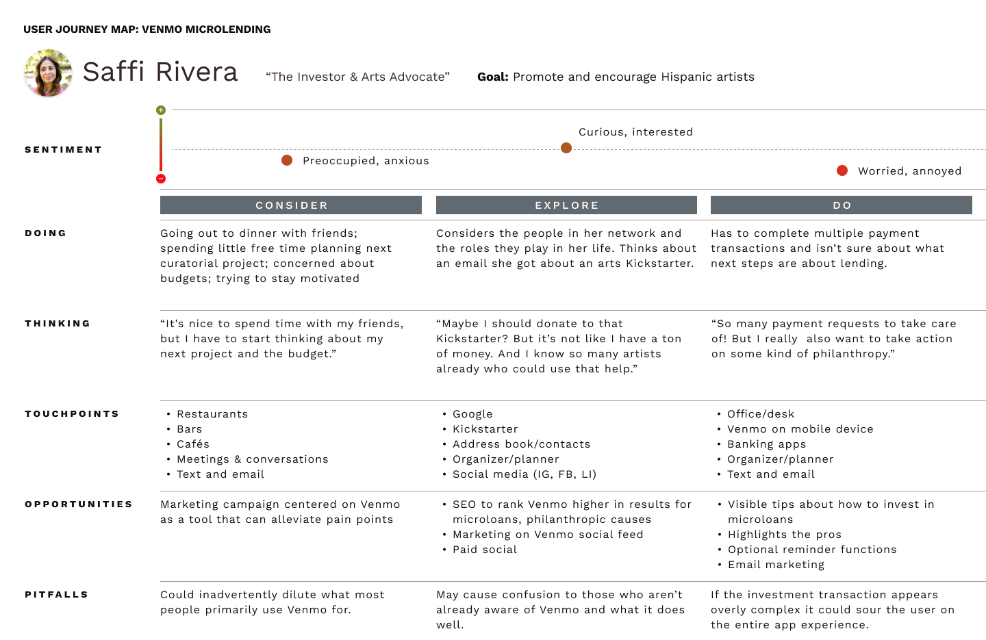
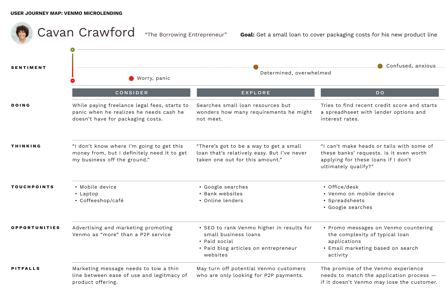
The research clarified that in this space there were four personas across two lending dimensions: loan as an investment and loan as a cause. Within each lending dimension we had the entrepreneur and the cause driven borrower. Below are the four personas:
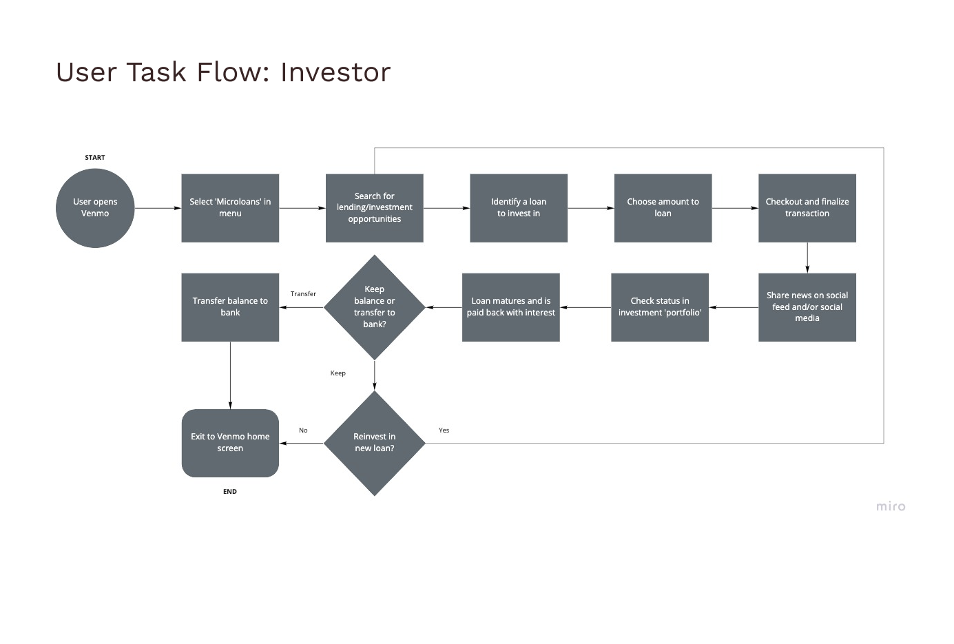
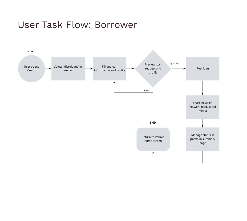
With personas now created, we proceeded to plot their journey maps and task flows. While building these maps, we had discovered emotional nuances at different points in the interaction that could be addressed in the microlending paths. Financial transactions, even on a small scale, can be a source of anxiety; how information is presented and paths defined could make a difference in whether users abandoned a microlending opportunity. Therefore, it was important to maintain the application’s existing flat structure to minimize disruption and ensure that various points in the task flows for borrower and lender addressed users’ anxieties.
The flows and maps are below:
EARLY CONCEPT WIREFRAMES
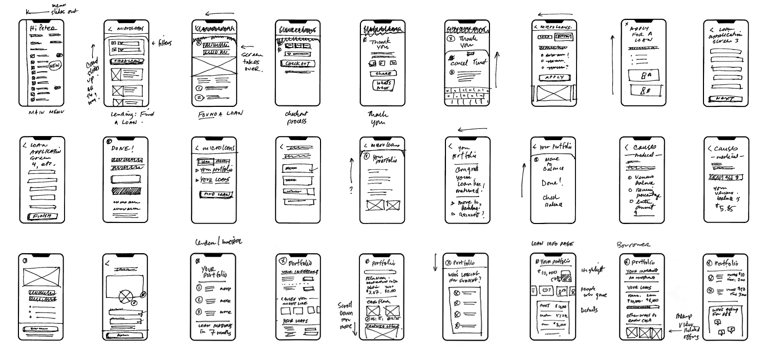
With the personas and the flows completed, we could proceed with several rounds of rapid prototype testing to iterate through some early designs. We started with sketches to identify which existing design patterns can be used and what other new ones do we need to create.
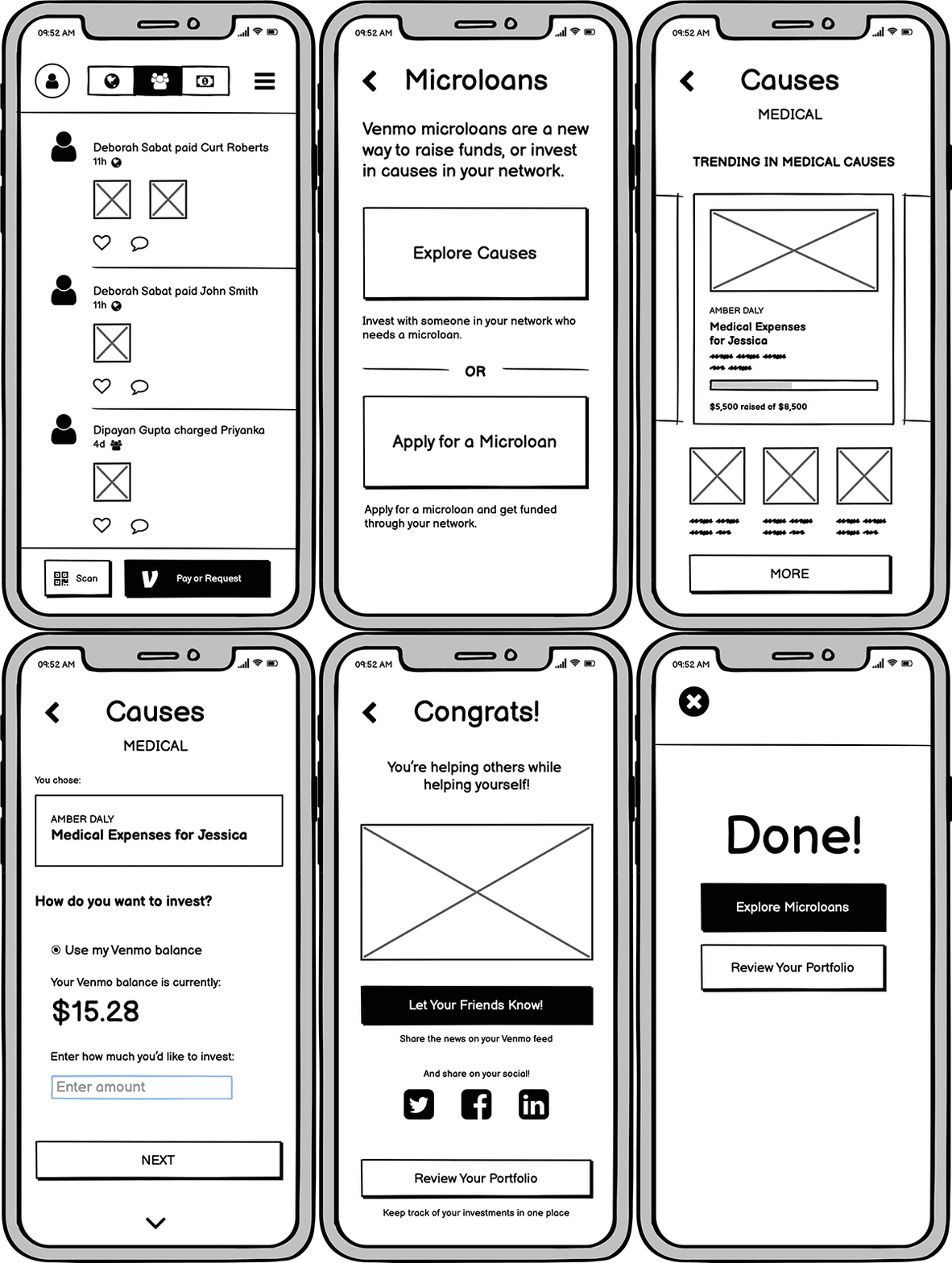
We followed this with rounds of testing with clickable prototypes. These rounds were extremely useful because they identified early one issues that our users struggled with. Many users were confused about the different paths between “lending” and “borrowing.” Users’ anxiety was pretty palpable and the cause varied from realizing that they were about to put money into an untested business to anxiety with financial issues in general.
Lessons Learned
There was a stark contrast in how experienced investors approached the whole process vs. people who have never had even a 401(k) plan (“casual investor”). Right before committing to invest in a loan most casual investors either got out completely from the flow or kept going back to the disclosures page. It was at this point that they realized what they are committing to that made them reluctant to continue the process. To make matters worse, users’ had a difficult time understanding the differences between friends and borrowers and just financial terms in general. What can be done to alleviate these problems?:
- Explanation of the various financial terms used throughout the application as well as better explanations on who bears the risk of lending the money and how guarantees work
- Explanation of what happens exactly once a loan application is submitted
- A breakdown of all the fees associated with the process and who is responsible for paying them
- What happens to a loan and its investors if the loan is not fully funded
