A More Intuitive Way to Display
Resume Information

A method to make the recruiting process less painful

Problem

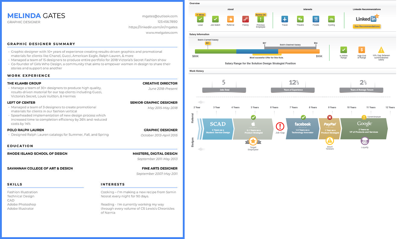
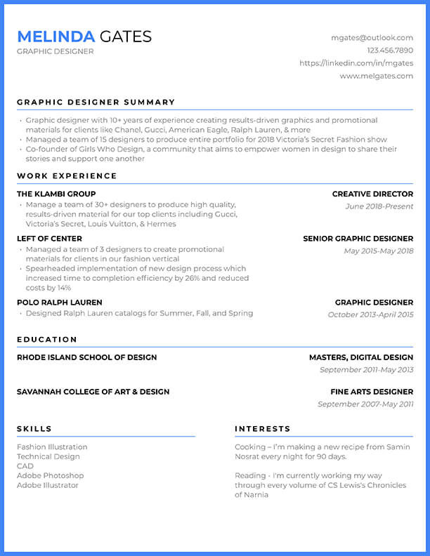
To hire for just one open position a recruiter would go through hundreds of resumes. In one extreme case one of our customers had 2000 applicants for 36 open positions. However, a recruiter has more than one position open at one time and volume decreases the ability to review accurately and effectively. Furthermore, like in the example below, text resumes come in a wide variety of formats, which makes it even more difficult to compare.
Solution

We created a visualization system that displays all the critical and relevant information in a meaningful and actionable way. It provides a standardized way for the recruiter to compare different candidates regardless the format in which they initially submit their resumes.

Team

■ Head of Design

■ Visual Designer

■ Product Manager

Process
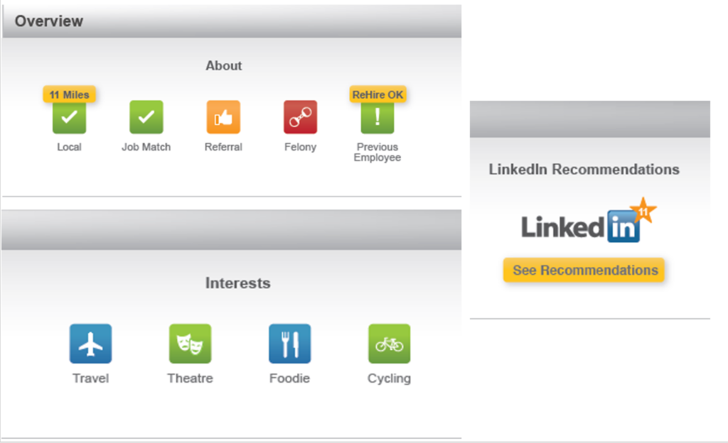
We explored different ways to breakdown the information in the resume. We started with the attributes that had a “yes/no” quality (e.g. former employee, local to the area, is it a referral, etc.). We elicited and incorporated the feedback from our customer base and the results of those iterations are below.
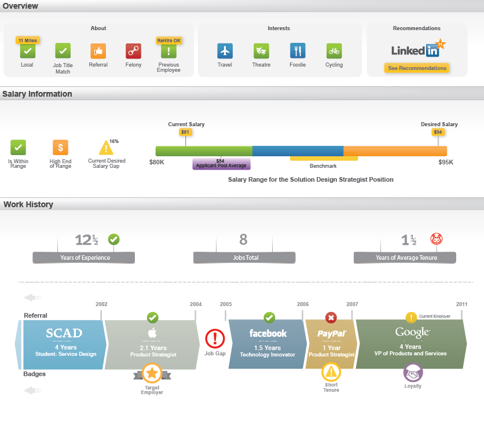
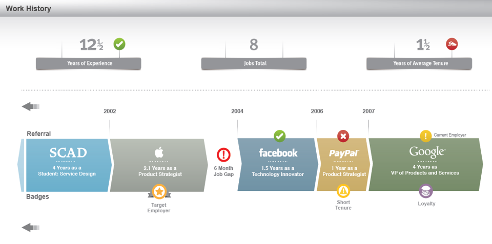
The work history timeline proved to be the most challenging part of the visualization. There are many potentially very important data points that recruiters need easy access to and not every recruiter wants access to the same points in the same context. In the end we decided on a horizontal timeline with the starting year displayed at the beginning of the bar and the bar length represents the number of years in the position. The recruiters have the opportunity to define and display a series of badges onto the timeline. For example, there are loyalty badges (if the candidate has been in a position for X years), gap badges (if there is an employment gap), job hopper alert (if the candidate has been in a position for fewer than X years) and target employer badge if the candidate has worked for a particular employer. The timeline is illustrated below.
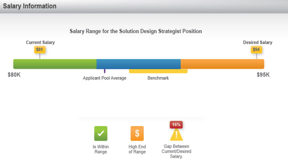
An important aspect of a candidate evaluation is the candidate salary expectation against the pay range the company has allocated for a particular position. Similarly to the other lines we had used in the research, we proposed a salary line, which displayed all the relevant, required information on an intuitive line. To draw the users’ attention to information that was particularly important to them, we also implemented a series of icons (which were user configurable) for highlighting that information as depicted in the picture.
Just by looking at the icons the recruiter can determine that this candidate is within the allocated pay range albeit at the high end of the range. There is also a significant gap between the candidate salary expectation and the current salary. If more information is needed, the pay line can also inform what the average candidate salary is or where the benchmark is in relationship with expectations and allocated pay range.

Final Design

In researching and creating this visual profile we used available technology and existing APIs that can process most of the data required to make it possible. All the information is presented in a visual format with access to the text resume if necessary. The version that came out of this research is shown below.

Results

data

The visual resume has the potential to change the way our customers work and the time it takes to make accurate recruiting decisions in dramatic ways. Using the visual resume gives recruiters a more meaningful candidate story. The decision which one to use is a straightforward one.

Recruiters will spend less time reading through reams of resumes and learn more about their candidates. That translates into a deeper understanding of a candidate’s background, strengths and weaknesses and, ultimately, a better assessment as to whether the candidates is a good fit for the position and the company in general. Some of the advantages of using the visual resume:

■ Mobile friendly

■ Faster candidate review

■ Information is easier to navigate, process and retain

■ More enjoyable review experience

user quotes

“Visual resume is game changing innovation that delivers the talent profile in a more compelling and consumable manner than anything I have ever seen. I see this as an industry leading innovation…”

“Game changing visuals like this will add stickiness to the product.”

“The prototype provides a visually significant differentiation that makes the application more useful not just for HR, but for the masses. We will have an increased close rate and less upfront discounting.”